Monday, 11 January 2016

One and Two point Perspective Drawing

One and Two point Perspective Drawing. 

Key Terms:
  • Perspective; One & Two Point
  • Observation 
  • Horizon Line/ Eye Line
  • Floor/ Ground Line
  • Vanishing Point 
Equipment:
  • T-Square
  • Pencil 
  • 45 Degree Set Square
  • A2 Drawing Board
  • Masking Tape
  • Rubber & Ruler (30cm & 1m)

One Point Perspective Drawing

1) First you need to get your board set up ready to draw. To do this you get your board in a landscape format and use masking tape to keep it in place. The best places to place the masking tape are at the top, on the left, on the right and also at the bottom. This picture below illustrates where to put the making tape.  

2) The next step is to find your vanishing point. To do this you will need to get your meter ruler and put one end in the top left corner and the other end in the bottom right corner. You can either use your pencil to mark the line from corner to corner or just mark a line near the centre. Once you have done this; do the same with your ruler but put it from the top right corner to the bottom left corner.     


3) Now you need to find the horizon line. To do this you have to keep your vanishing point by using your rubber take away the diagonal lines but keep your vanishing point. Next take your T-square and but the top of the T to the left side of your board horizontally. Now you can use your pencil to draw the horizon line like this shown below.      


4) Now you can add in your back wall. This is done by you drawing a box using the T-Square to assist you in drawing the horizontal lines and the T-Square and the 45 degree set square for the vertical lines. You can make this wall as big as you need it but below is a quick example of a finished back wall.  

5) After step 4 you are ready to add in the ceiling lines and the ground lines. This is accomplished by using your 30 cm or your 1 meter ruler. You need to draw a line from a corner of the back wall you have already drawn, to the corner of your A2 paper. You will need to repeat this for each corner of the back wall. Once complete you should have something like this below.    


6) Finally you can add in extra sections of the room you are doing. For my example I am going to add another wall coming out from the back wall. To do this I used the T-Square for the horizontal lines and the vertical lines as well as the 45 degree set square. I first drew the square in the for ground and then joined the left corners to the ceiling line to make the impression of the second wall coming out.    


Two Point Perspective Drawing


1) To begin this two point perspective drawing you will need to follow step 1 to 3 from the one point perspective drawing guide. 

2) Next you have to plan where the corner of your wall is going to be. Once you have an idea you need to get your T-Square and your 45 degree set square to draw the line of your wall corner. Like the one below. 


3) Now from your horizon line you have to mark out your 2 vanishing points like the black dots on the image below. 


4) Now anything on the right of your wall corner from the wall corner will join up to the right vanishing point. Like is shown in the image below.


5) everything on the left of the wall corner from the wall corner will join up to the left vanishing point. Again as shown in the image below. 


6) now you can add other lines to your image to make it like the room you are drawing. All the horizontal lines are always horizontal, all the vertical lines are always vertical, all the diagonal lines pointing towards the right should always be in-line with the vanishing point on the right, all the diagonal lines pointing towards the left should always be in-line with the vanishing point on the left. All of this is displayed below. 

Monday, 4 January 2016

Report For Manchester Convention Complex Trip (500 words min)

On Monday 23rd November 2015, there was an exhibition in Manchester Convention Complex Centre. Although I didn’t go to the exhibition myself, I did a lot of research about it all from the visitor guide that I got from my tutor on Facebook. I downloaded and printed this off so I could still have a look at what the exhibition included. I looked at the list of Universities and colleges that were being exhibited, and then I made a list of the ones which are on the UCAS website. Also on the same list I noted down some potential courses that I might consider taking a closer look at. After this I made a second list from the first of all of the Uni’s and Colleges I’ve looked at on the website, linked the hyperlink to each one, and also narrowed it down to one course I like of each Uni or College.  On the second list after all this; I have made a quick note about the top 9 Universities or Colleges I really like. One I had had a full examination of the top 9 Universities and Colleges website for each course I made another list for all the key information for each Uni or College I like. In this list it consist of; the name of University or College, the name of the course, the UCAS code, the duration of each course, the study period the course is listed as (part or full time), the location of the course on campus’, the qualification that I could achieve at the end of the course, and also the fees per year of the course.

These are the top 9 Uni’s and Colleges that I have mainly researched from the visitor guide; Bath Spa University, Leeds College of Art, University of Derby, University of Cumbria, University of Lincoln, University of East London, University of Huddersfield, Manchester College and Ravensbourne. Now here is the information for each Uni/College I have researched.


University / College
Bath Spa University
Course
Creative Computing (Software Development)
UCAS Code
8GD3
Duration
3 Years
Study Time
Full Time
Location
Newton Park
Qualification
BSc (Hons)
Fees per Year
£9,000.00


University / College
Leeds College Of Art
Course
Graphic Design
UCAS Code
W214
Duration
3 Years
Study Time
Full Time
Location
Leeds College Of Art
Qualification
BA (Hons)
Fees per Year
£9,000.00

University / College
University Of Derby
Course
Animation
UCAS Code
W615
Duration
3 – 4 Years
Study Time
Full Time
Location
Markeaton Street Site
Qualification
BA (Hons)
Fees per Year
£9,000.00


University / College
University Of Cumbria
Course
Graphic Design
UCAS Code
W215
Duration
4 Years
Study Time
Full Time
Location
Brampton Road Campus
Qualification
BA (Hons)
Fees per Year
£9,000.00


University / College
University Of Lincoln
Course
Creative Advertising
UCAS Code
W213
Duration
3 Years
Study Time
Full Time
Location
Lincoln Campus
Qualification
BA (Hons)
Fees per Year
£9,000.00


University / College
University Of East London
Course
Architectural Design Technology
UCAS Code
K101
Duration
3 Years
Study Time
Full Time
Location
Architecture, Computing and Engineering Site
Qualification
BSc (Hons)
Fees per Year
£9,000.00


University / College
University Of Huddersfield
Course
Architecture (RIBA Part 1)
UCAS Code
K100
Duration
3 Years
Study Time
Full Time
Location
Queen’s Street Studio
Qualification
BA (Hons)
Fees per Year
£9,000.00


University / College
Manchester College
Course
Fashion, Costume & Textiles
UCAS Code
WW43
Duration
2 Years
Study Time
Full Time
Location
Shena Simon Campus
Qualification
HND
Fees per Year
£9,000.00


University / College
Ravensbourne
Course
Graphic Design
UCAS Code
W210
Duration
3 Years
Study Time
Full Time
Location
Ravensbourne Campus
Qualification
BA (Hons)
Fees per Year
£9,000.00


A2 Pages With Annotations

This is a moodboard for my research for books for children aged 5 to 11. All of these books are some of the top stories by the best children authors in 2015, also these books feature some of the best illustrators such as Quentin Blake, Tony Ross and many others who vary at age range for their work. I will be taking this forward by looking more in depth by selecting a few of the books and researching the illustrators of those books. The main influences are really just from either Amazon.com top children's books or on a Google search for again 'top children's books 2015'. 


Here is another of my moodboards. This board is more based on illustrators rather than authors too. this board features some of my all time favourite books such as; The Lion, The Witch & the Wardrobe, Tracy Beaker stories, Charlie and the Chocolate Factory, The witches and many other illustrations from more children's books. As Roald Dahl is one of my favourite authors, I will be moving on to look more in detail at the illustrator for most if not all of his book; Quentin Blake. I will try to re-create some of my favourite illustrations from a few of my favourite novels.    


This sheets is a critical study of some of Quentin Blake's work. The large square is based from the novel of Matilda, which he illustrated. The other square is of the chocolate factory from Roald Dahl's Charlie and the Chocolate Factory. I'm not 100% sure about which book the girls with the funny hair are from but I really like how they turned out. for all of these critical studies I used both ink and water colour paints to try to re-create Quentin Blake's work. I really like how I mixed things up a bit with the Matilda study as I added more images I designed of my own to create what she could be thinking about in her own little world.     


On this I looked at Tony Ross. I chosen him as when I was doing research at my dad's house I asked my brother what books he remembers reading when he was in primary school. he said that the David Walliams children's book collection were the ones he remembers the most. When I looked more in detail at this collection of books, I noticed that there were two illustrator; Quentin Blake and Tony Ross. So this is the reason why I chose to pick these two for my critical studies. The types of media I used for this study were also ink and water colours. I also used wax crayon for the 'Horrid Henry' doodles on the photographs. 
  
This is my customer board. For this I imaged a customer to base my research and have a good idea of the kind of customers I am aiming my work at. So for my customer I made up a young boy called Leo, who is aged 7 and also has a younger sister called Lexi who is aged 3. They both live with their mum and dad in Barnsley. Leo is in year 3 at Shawlands Primary School, which is where he met his 5 best friends called; Tina, Max, Thomas, Hope & Timmy. His very best friend is Timmy who shares the same birthday with Leo; 1/1/2009. Leo has many favourite things he like, for example; 
  • Favourite letter: F
  • Favourite Book: The cat in the hat
  • Favourite number: 38
  • Favourite food: ham sandwiches
Leo also has an imaginary friend, a parrot called Trixie. Within Leo's home, his family share a rabbit called Snowball & a lizard called Toby. The things Leo likes are; bike riding, playing on the Xbox, maths, art and his biggest dream is... To become Iron Man one day. 

I am going to take all this information I have create about my customer to help me to design a library wall and 2 display boards in the library suitable for my customer Leo.  
 
 
This is another artist research sheet. on this sheet I explored two artists; Charles Roger Hargreaves & Lucy Cousins.
Charles Roger Hargreaves:

Charles Roger Hargreaves was the original creator of the Mr Men book collection. His first book was Mr Tickle. Charles has named himself as Roger Hargreaves as his pen name as the author of his books. Roger is the world's 3rd best selling author and his books have sold over one hundred million books world wide.
Lucy Cousins:

Lucy has been sharing her work with the world form her home in Hampshire with her husband and their four children. All in all, her books in total have sold over 31 million copies world wide. One of her most famous book's; "Za-Za's Baby Brother", won the National Art Illustration Award in 1997. She has also illustrated; "Hooray for Fish", " Doctor Masiy" along side other Masiy books, and also "Jazzy in the Jungle".


This sheet is my first design sheet. I have brought forward the idea and developed it from the Tony Ross research I have done in my sketchbook. The idea is basically paint the wall a 'happy yellow' (683 from wilko's) then take eight sheets of A3 paper and make 40cmX40cm squares with them. Once this has been completed the can have a boarder painted on using acrylic paints. After they have dried, they can be laminated. Once laminated they can be put up on the wall. All that's left to do then is to some dry wipe pens in a rectangular pot and Velcro them to the wall next to the sheets.  

 
This sheets is my second design sheet for the library wall. I have taken this from my research about Charles Roger Hargreaves, the author and illustrator of the Mr Men & Little Miss book series from 1971 to 1988, when he died. My designs are just a white background and painted character and works that relate to the name of each character on the wall. The writing will be on black A2 paper and the letters will be printed off on to A4 with full colours and laminated to give it a professional finish.   
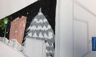
This is my third and final design for the library wall. I have based this design on my personal favourite book, The Lion, The Witch & The Wardrobe written by C.S. Lewis and illustrated by Pauline Baynes. As I have always loved this book since my nannan first read it to me when I was 3, I have kept the same copy of the book so I could always enjoy the story and now I can read it to my own child. This design will; just like the Mr Men design, be just paint on the wall.   


This is a design for the KS1 display board, inspired by the same author and illustrator as for one of my designs for the library wall; Charles Roger Hargreaves. The Mr Men books have been another personal favourite book of mine since I was little so this is why I chose to base it on both parts of my designs. The Mr Men, Little Miss & the words in the design will all be either printed off onto A3 and laminated or painted and laminated. The boarder will be just printed off by not laminated.     
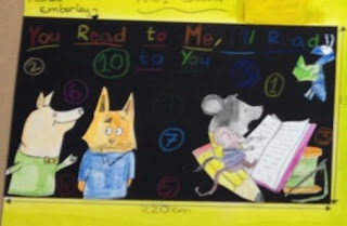
This is just a simple design for the KS1 display board based on a book which can only been founded in my moodboard research. It about a book called "You Read To Me, I'll Read To You". These are a series of books which hold very short stories in them. They are written by Mary Ann Hoberman and illustrated by Michael Emberley. All the images on this design will be drawn on A2 and painted using water colour paints then laminated. The numbers and the title will be written on the black paper background with coloured pencils.   
 
This design is for the KS2 display board. As you can see but the illustrations, its based on the works from Quentin Blake. The Matilda, the BFG, the speech bubbles and the thought bubbles, and also the balloons will be painted onto A2 paper using water coloured paints, then laminated. Once this has been done the y will go onto a red tissue paper background.         

 This design is again based on the book from The Lion, The Witch and The Wardrobe. I have stuck with this design as I really love this book. The background are illustrations from the book itself, I will make them by printing them on A3 paper in section so the fit on the board. The world will be again printed on A3 paper or painted on A3 paper then laminated and stuck on the background with staples or blue-tack.


Lucy Cousins:
The KS1 design is based on my research I did about Lucy Cousins. She illustrated children’s book such as; Za-Za’s Baby Brother, Doctor Maisy and also Jazzy in the jungle. All of the images are from her books she has illustrated. The background is paper painted with water colours just like the images. This is how they will be painted but just drawn on A2 paper.  
Nick Sharratt:
This final design is about the work of Nick Sharratt, the illustrator of Jacqueline Wilson’s books. I have taken these illustrations from a leaflet I got when I visited an exhibition about his work at the Civic in Barnsley. I will draw them on to A2 sheets and then use water colour paints for the colour. I really like the Nick Sharratt design with the books with numbers in them. This will be made by drawing a book on A4 and photocopying it 9 more times to get the 10 books for around the edge. Then once the books have been printed they can be mounted on to coloured paper to make it seem like there are covers on the books not just white. After the numbers have been written on the books with coloured pens they can be laminated.